

We build a sales cube on top of automobile Data from the U.S. In this article, learn how to slice and dice the dataset across multiple axes — the customers, the cars, and the brands to find interesting KPIs and summarize the KPIs in an Atoti dashboard.
PART 1: Sales Cube and how Atoti can ‘boost’ it.
What is a Sales Cube?
Sales cubes are used to report on sales transactions, specifically concerning posting sales order invoices and sales order packing slips. Sales cube datasets are self-containing and do not require users to create table profiles.
Various units of measure can be incorporated into a sales cube report to ensure that the quantity is correct, like using a SUM, MEAN or COUNT value.
Dimensions, Measures, and Hierarchies explained.
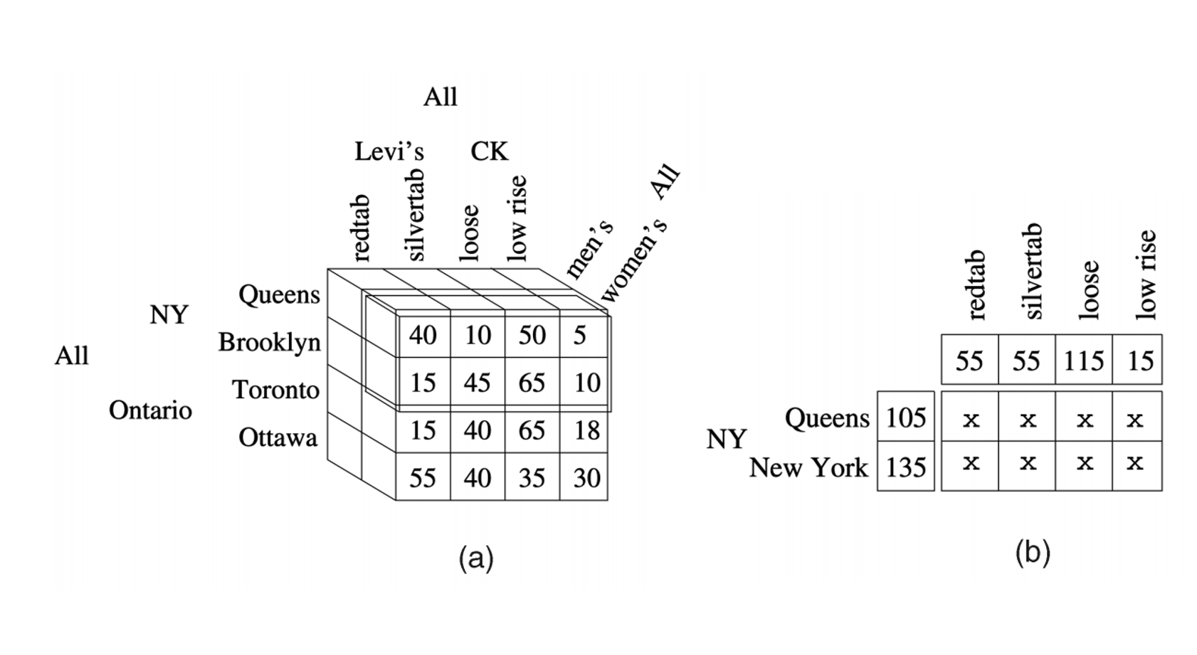
Here we will use the sales cube data in Atoti to slice and dice the data. The sale cube shares the concepts of Hierarchies, Levels, and Measures with the multidimensional analysis or OLAP.
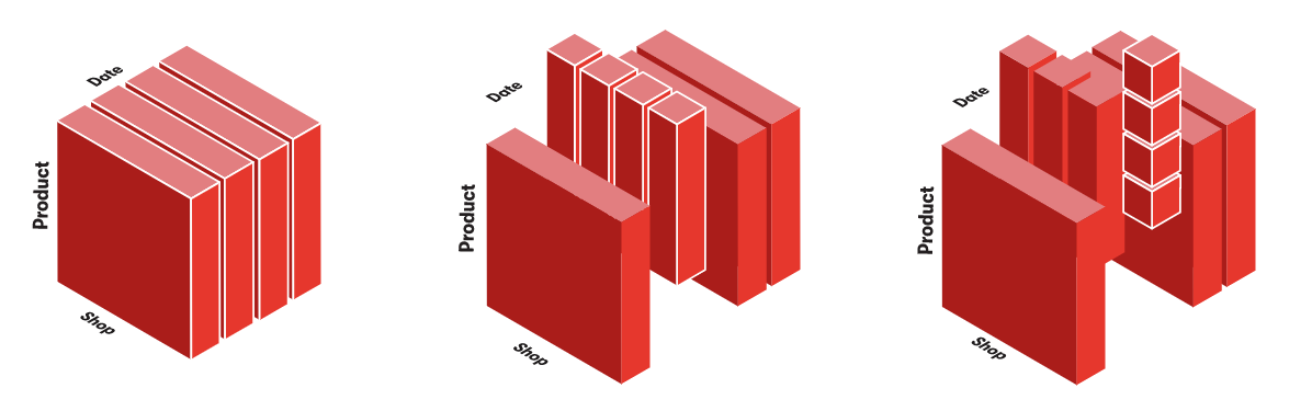
Once we have the dataset, we transform it into a data cube so that the dataset has multiple dimensions; unlike the stereotype idea of a cube, the data cube need not be in just 3 dimensions. It can be in as many dimensions as the number of variables.
Dimensions
Typical cube dimensions are Time, Customers, Products, Locations, Employees, Projects, etc. Use dimensions that are best suited to your business domain.
Each dimension can have either just a detailed level of all dimension members or you can define hierarchy with several levels.
For example, the Customer dimension could have Country, State, and Customer Name levels. Typically each dimension has an All level with one All member, which aggregates all dimension members.
Hierarchies
The axes of the cube are called hierarchies. After an initial hierarchy has been created, you can define additional hierarchies for a single dimension of a cube. This enables you to have multiple possible drill paths for the same data.
Measures
Measures typically are integer or decimal values that can be accessed either at the detailed dimension member level or can be aggregated at higher dimension levels. Typical measure examples could be Sales amount, Units sold, Cost amount, Transaction count, etc.
The purpose of the multidimensional analysis is to visualize some numeric indicators at specific coordinates of the cube. These indicators are the measures.
An example of the measure would be the number of products sold. All measures are automatically aggregated (typically as a sum of detailed level values) in upper hierarchy levels. E.g., looking at Sales amount measure at the Country level will give the total sales amount for this country.
Sales Cube made easy by Atoti:
The above concept of creating a cube from a dataset and creating dimensions, measures, and hierarchies on that data to analyze is the basics on which Atoti works. You have to create dimensions, measures, and hierarchies for any dataset being loaded in Atoti.
Atoti stores can handle more data than pandas DataFrame. pandas can start to slow down with datasets larger than a few GBs while Atoti scales more efficiently.
Using Atoti, you can build an advanced data model using joins between stores. The data is not duplicated like when you perform a merge in pandas.
Atoti has embedded interactive data visualization tools to give you quick insights. The visualization is not frozen: you can build a dashboard and share it with other users who can still interact with it (for example, by adding filters). And there is no need to write code to define your graph!
PART 2: The Dataset
Here, for this analysis, we will use a dataset on car sales in the U.S. The dataset is synthesized by taking inspiration from the actual car sale numbers reported in the U.S. for 2018 and 2019 for three car brands- Audi, Mercedez Benz, and BMW.
Data Tables
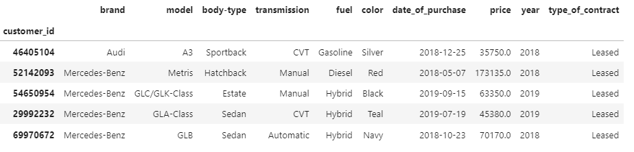
Here, we consider car sale data in the US market. There are two data tables, one on the car level and another one on the customer level.
The customer-level data consists of a primary key as the customer_id, and there is demographic information like — sex, age, job, and the city and state of residence of the customer.

Another data table is the car sales data; this dataset consists of the information about the car purchased by the customer, which the customer_id can identify.
This table has information like:
Brand: what was the brand of the car, here we are considering cars from Audi, BMW, and Mercedez-Benz. Model: For a given car maker, what was the model name. There is also information on body_type, i.e., Sedan, Hatchback, Estate, etc. Then there is information on transmission, fuel, the car’s color, the date of purchase, and type_of_contract — whether it was a purchased or a leased car.
Loading the data in Atoti
These tables are loaded into Atoti as cars and customers’ datastore, and then they are joined on the customer ID. Here, an assumption is made is that one customer has bought one car. In the scenario when one customer has bought multiple cars, the functionality will not change.
The data from the two tables is then loaded in Atoti, and a cube is created with the option to define hierarchies, levels, and measures as per the business requirement.

PART 3: Defining the KPIs and reporting it into the dashboard.
Here we have done an analysis on three different aspects -in terms of the number of cars, the car sales break up by brand and model, and then a customer level analysis — i.e. the relation between the demographics and the cars. So let us see in detail the three analysis:
Analysis 1: The number of cars sold
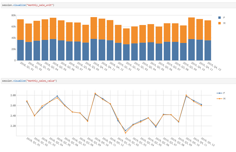
In the first set of analyses, we will consider how many cars have been sold and slice and dice this number along the various axes. This includes a pivot table to get the number of cars sold and their total value on a monthly level.
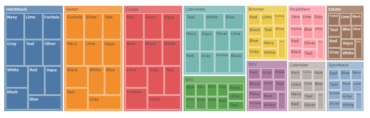
Another KPI to look at would be the breakdown of the number of cars by the Body type and color in a TreeMap in Atoti.
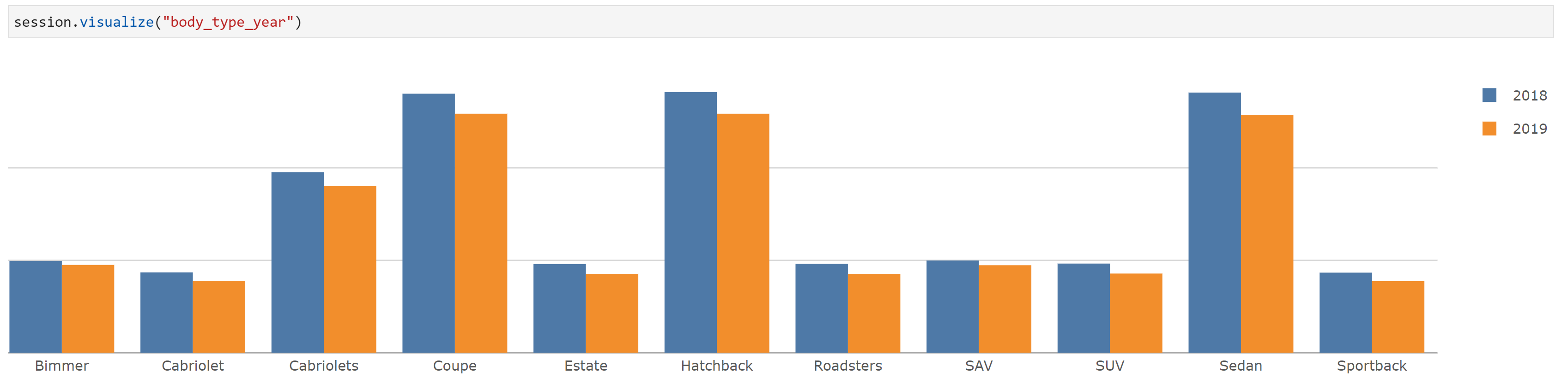
Another KPI to look at is the sale for the different body types in the two years being considered.
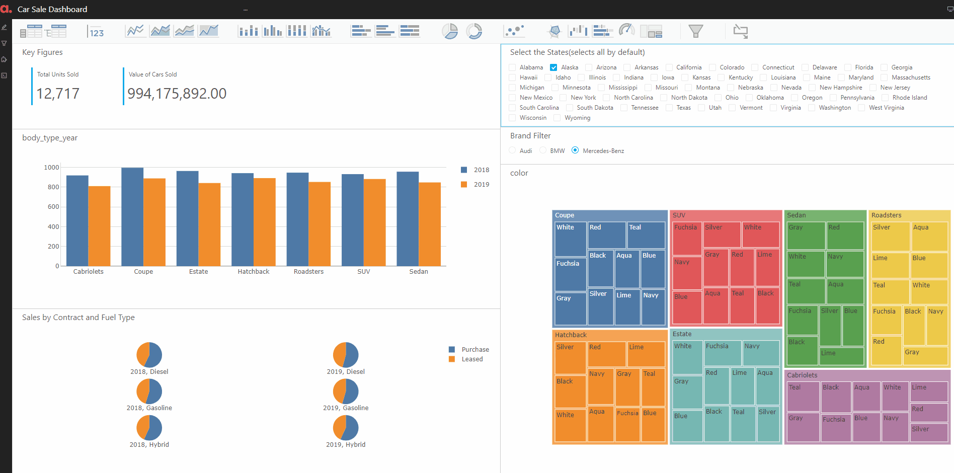
Finally, we put the above KPIs and widgets corresponding to them in a dashboard. The dashboard also has filters on state and brand. Hence, this will enable the user to find the sale of various car brands in different states by easily filtering on the state/brand of interest.
Analysis 2: The Car sales breakup by brand and model.
The next analysis focuses on finding the best and worst-performing models for each brand in sliced by fuel type and the type of sale etc.
This analysis can be seen as an extension of the 1st analysis done above. Here we plot the timeline for the number of cars and the value of cars sold.
And then, this information is loaded into another interactive dashboard that lets you choose the transmission and fuel consumption of the vehicles from all three brands and shows you the top model for that brand and the sales from the filtered category.

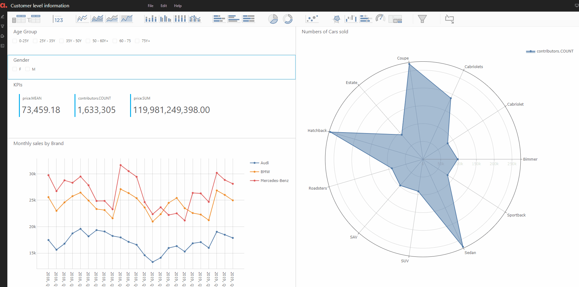
Analysis 3: Customers Level Analysis.
Finally, we perform an analysis on the customer-level insights. We will create buckets from the age of the customers and on that to our original data store — thanks to Atoti, all of this can be done on the fly!

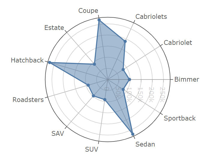
Finally, we create the KPIs on the number of cars bought by the people in the various age buckets. And we plot it on a radar plot in Atoti.
Here, we also plotted the sales of the cars in terms of the number of cars and the total value of sales split by the customers’ gender.
Putting the information in the dashboard can be shared with other users to find more deep insights on the customer bucket of interest.
Conclusion
Here we learned what a sales cube is, and we built our own sales cube on a dataset on the U.S. automotive industry sales numbers. We saw how building a sales cube in Atoti is much faster and easier than doing it otherwise.
For the detailed source code and many other such interesting use cases, do check out the Atoti notebook gallery on GitHub. This sales cube analysis can be found here.
If you have also used Atoti to build a sales cube, please share your success story with us, and we will share it with the Atoti community.
Thanks for reading!