

See How we Use Atoti to simulate and Visualize ML-Based Collateral Shortfall Predictions.
This article is derived from a previous one available on our website around Collateral optimization. For context, we’re copying here the first part of this article by Hui Fang Yeo. The scenario starts diverging at the ‘What-If’ stage to integrate predictive machine learning algorithms. Jump to that part if you are already familiar with the use case.
You walk into a pawnshop with a precious Patek Philippe watch you inherited from your father that is worth around $80,000. The pawnbroker looks at the watch and makes an offer of $64,000 with a 1.5% interest rate. You take up the offer and the pawnbroker takes over your watch. In the event you fail to redeem it in 6 months, the watch will be auctioned off.
What we just described is one of the oldest forms of secured money-lending where the borrower has to pledge items to the lender in exchange for a loan. The pledged item, in this case, the watch, is known as collateral.
Though the market value for your watch is $80,000, the pawnbroker has to assume the risk of fluctuation in its value, especially when it is a second-hand watch. To cushion his risk, the pawnbroker offered a loan at 80% of its current valuation. This meant that a 20% haircut is applied, setting the collateral value of your watch at $64,000.
Now imagine again that you needed only $50,000 and this worked up to a total interest of $4,500 at the end of 6 months. If you loan the full collateral value, you will have to pay a higher interest of $5,760. You decided to go for the $50,000 loan instead. The pawnbroker hence has a cash-out value of $50,000 for this transaction.
Key definitions:
Market value — Value of asset in the market
Haircut — percentage reduction in market value to account for the risks involved
Collateral value — Value of asset after applying haircut to the market value
Cash-out — Actual amount of the loan
This form of money lending, at a different scale, is still very common in the finance industry. It has evolved to include various forms of assets used as collateral. These could be stocks, bonds, real estate, metals and commodities, etc. In this article, we will explore how we can utilize Atoti to monitor the collateral against the market risk.
Secured lending via collateral
Skip to Atoti Analysis Playground or Collateral Monitoring Dashboards if you are already familiar with collateral.
Collateral is a form of credit risk mitigation that is subject to a wide range of risk drivers:
Relevant risk management policy (e.g. market risk or liquidity risk)
The collateral value may go below the loan amount, resulting in what is known as a collateral shortfall. The lender may decide to issue a margin call for the borrower to top up the differences in order to cover possible losses.
Contract enforceability
In the above example, if you were to default the interest repayment for the watch, the pawnbroker has every right to recover his loss by auctioning the watch.
Collateral portfolio diversification
Having a diversified portfolio reduces the risk as different assets react differently to market events.
Common ways of managing these risks include:
- Daily valuation
- Concentration risk monitoring
- Liquidity and volatility monitoring
- Portfolio diversification
- Margin calls, coverage, etc.
Setting up the analysis playground with Atoti
Skip to Collateral Monitoring Dashboards if you are already familiar with collateral.
UPDATE: The GIFs and code snippets in this article are based on an older version of Atoti. We have released much smoother and even more functional dashboards and widgets with the latest version of Atoti. Check out this link to see the documentation of the latest version of Atoti.
In this article, we explore a Jupyter notebook that uses Atoti libraries to generate some charts that help us with a simple use case of collateral shortfall monitoring.
It’s common for data to come in various formats such as CSV and parquet, and this is the case here. Using Atoti libraries, we are able to consume the data and create an in-memory multi-dimensional data cube with the following datastores setup
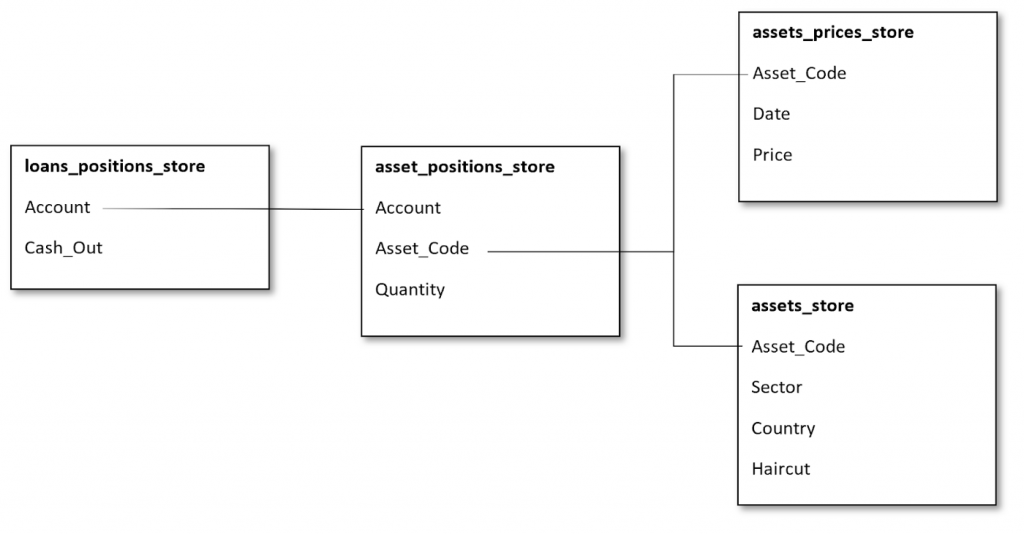
Atoti automatically created all the non-numeric data columns into hierarchies and the numeric data columns into measures for us. As a result, we have these measures:
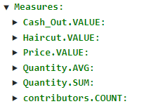
Measures created automatically
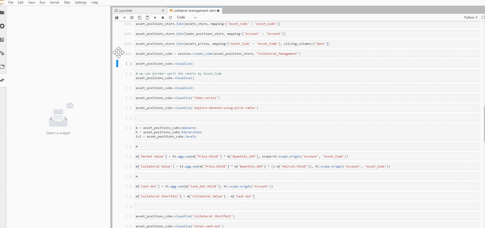
We are still missing a few measures such as market value, collateral value, and the collateral shortfall value which we want to monitor.
To derive the market value, let’s create the measure in the cube:
Market Value = Price x Quantity
We have to apply the haircut to the market value to get the collateral value:
Collateral Value = Market Value x (1 — Haircut)
Finally, we can calculate the collateral shortfall:
Collateral Shortfall = Collateral Value — Cash out
Atoti libraries allow us to easily create a visualization of our data in charts, pivot-table, tabular or even a featured values widget.
After we are satisfied with slicing and dicing the data cube, what’s next?
Jupyter notebooks are easy to use and the visualization Atoti provided is great. However, it is not user-friendly enough for us to show to our end users, who are not interested in seeing all the Python codes.
Collateral Monitoring Dashboards
Many libraries, such as dash or Altair, allow interactive visualizations on Jupyter Notebooks just like Atoti. However, Atoti takes one step further to allow the publishing of these widgets into a bundled UI — the Atoti UI.
From the gif below, we see how easy it is to put a dashboard together. We can now save and share the dashboard with our end-users with zero codings from their end!
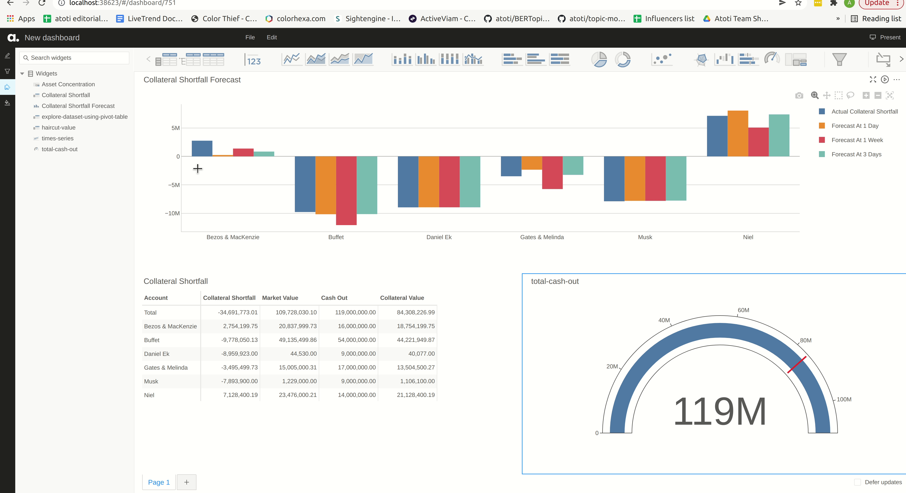
We can dive into the dashboard in the Atoti UI. From the series of built-in widgets, we add a quick page filter on the Account level so we can switch from global to account-level view on the collateral status on the dashboard.
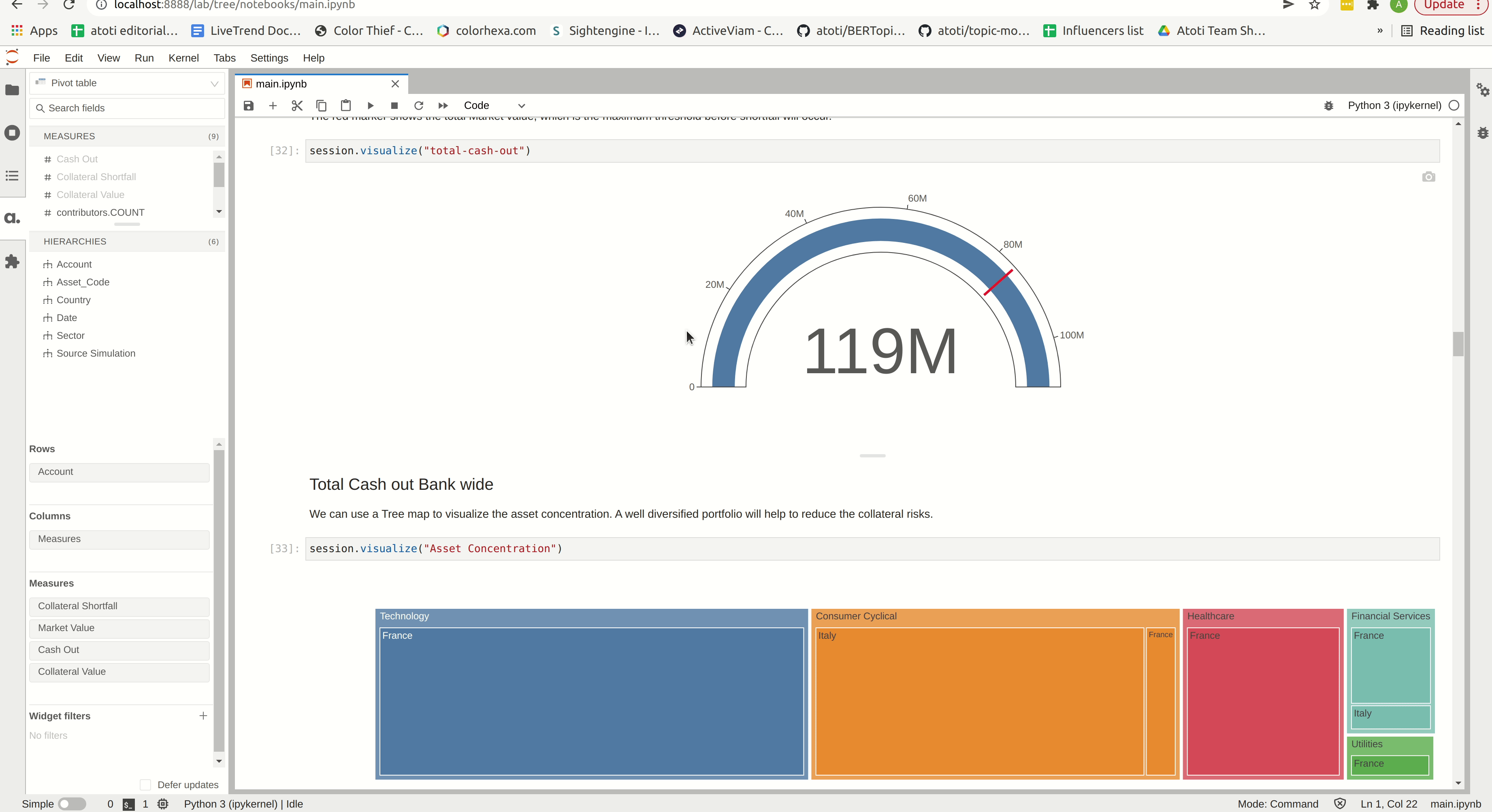
Atoti’s in-memory data cube plays an important role in the near-zero latency we see during the switch in the account. It enables the real-time data aggregation of the measures, allowing us to drill down to any hierarchies or levels.
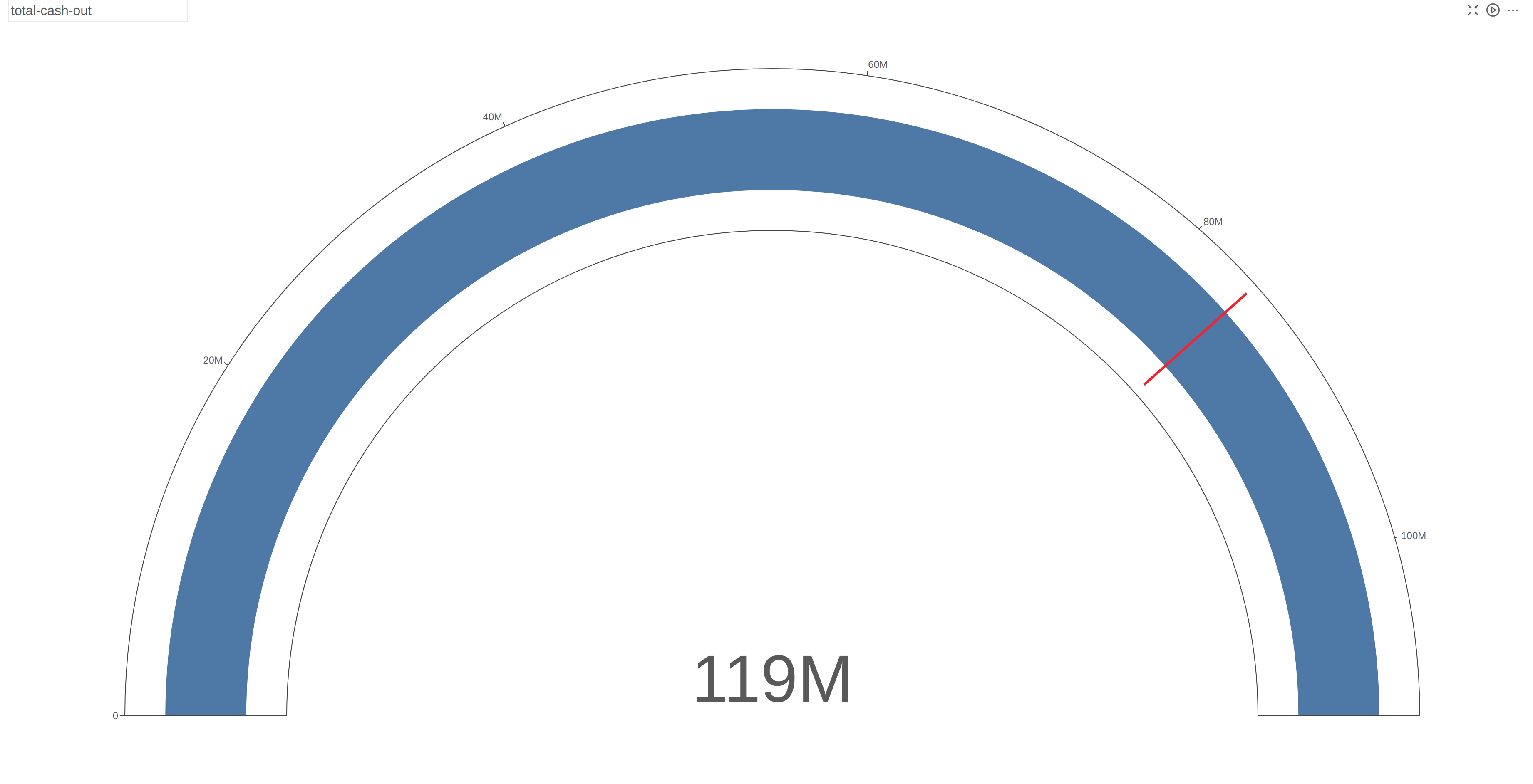
In a total cash-out situation, we can see that the bank is still well within the threshold of the total collateral value. The full range of the gauge indicates the total market value of the assets.
Zooming in on the dashboard for two accounts, we can immediately see the differences in their risk levels:
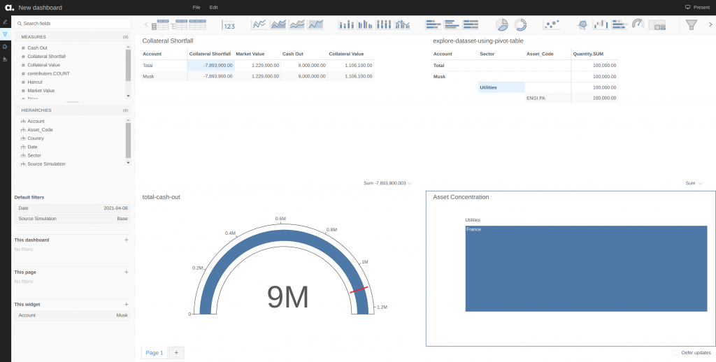
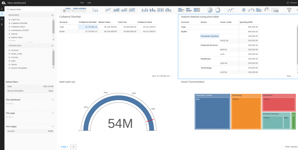
Both Musk and Buffet are having collateral shortfalls of -7,893,900.00 and -9,778,050.13 respectively. However, given that Musk only has assets under the Utilities sector in just France alone, the risk of default is very high if the sector crashes. In the case of Buffet, having a well-balanced portfolio helps cushion fluctuations coming in from any single sector at one point in time: the chance of all the sectors crashing at the same time is very low. Therefore, Musk requires closer monitoring compared to Buffet.
Collateral Forecast
What-ifs
Now that we have basic monitoring of Collateral Shortfall, we can do some simulations in the data cube.
First, it is important to mention that there are two kinds of simulation in Atoti:
- Measure simulation
- Source simulation
In Measure simulations, we modify the value of the measures in scenarios of the simulations without duplicating data.
Source simulation, on the other hand, is a simulation created by loading a new source of modified data into the cube.
Here, we can use the source simulation, for example, to simulate variations in the price by considering the price forecast at different time horizons and analyzing the impact of the projections of the Collateral Shortfall.
- 1 day
- 3 days
- 1 week
For each forecasting time horizon, we will predict the Collateral Shortfall.
In fact, these situations correspond to some cases where the portfolio manager has to make decisions based on the projections for the future. So he will need to consider the value that the different assets are likely to have in a near future and choose the best strategy in terms of what horizon he should consider for the projections, considering the necessary time to make the decision and the reliability of the forecast.
Scenario 1: Forecast At 1 Day
We replace the original Price column with the one corresponding to the price forecast at the 1-day horizon. Then, the calculation of the collateral shortfall is automatically derived from the new price values following its formula defined precedently.
Setting up the scenario is simply:
predictive_simulation = assets_prices_table.scenarios["Forecast At 1 Week"]

with session.start_transaction(scenario_name="Forecast At 1 Week"):
    predictive_simulation.drop()                          # Clear the data from the "base" scenario before loading our new data
    predictive_simulation.load_pandas(assets_prices_df)   # Load the new prices corresponding to a forecast at 1-week horizon
Scenario 2: Forecast At 3 Days
The same steps are applied for this case, we simply replace the original Price column with the one corresponding to the price forecast at the 3-days horizon.
predictive_simulation = assets_prices_table.scenarios["Forecast At 3 Days"]

with session.start_transaction(scenario_name="Forecast At 3 Days"):
    predictive_simulation.drop()                          # Clear the data from the "base" scenario before loading our new data
    predictive_simulation.load_pandas(assets_prices_df)   # Load the new prices corresponding to a forecast at 3-days horizon
Scenario 1: Forecast At 1 Week
We replace the original Price column with the one corresponding to the price forecast at a 1-week horizon.
predictive_simulation = assets_prices_table.scenarios["Forecast At 1 Week"]

with session.start_transaction(scenario_name="Forecast At 1 Week"):
    predictive_simulation.drop()                          # Clear the data from the "base" scenario before loading our new data
    predictive_simulation.load_pandas(assets_prices_df)   # Load the new prices corresponding to a forecast at 1-week horizon
Now, let’s compare the projections at the different time horizons:
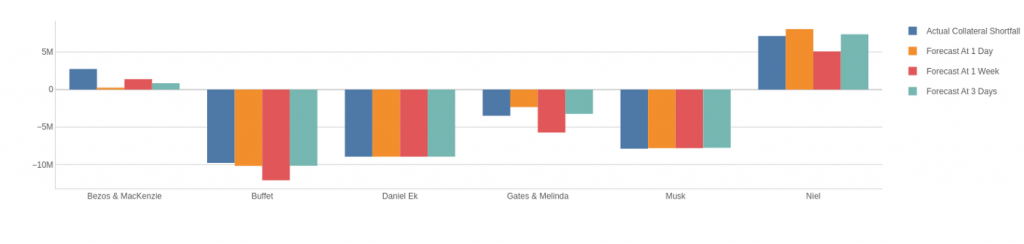
We observe that, in general, the projections at 1-day and 3-days time horizons are better than the 1-week horizon. As we are dealing with time series forecast, this is perfectly expected: the closer the forecast horizon the better (more accurate) the prediction.
However, there is an exception here for Musk and Daniel EK for whom the projections are the same for the different models. When we look at their portfolio closely, we notice that they only possess the assets with associated codes TIT.MI and ENGI.PA from the Communication Services and Utilities sectors respectively. Indeed, as shown in the following results tables, the different forecasting models perform at the same level for these two assets.
Result summary for asset code AC.PA:
|                      |   y_mean |   y_std |   ŷ_mean |   ŷ_std |    R2 |   RMSE |   MAPE |
|:---------------------|---------:|--------:|---------:|--------:|------:|-------:|-------:|
| Prediction At 1 Day  |   30.732 |   2.246 |   30.88  |   2.401 | 0.956 |  0.22  |  0.008 |
| Prediction At 3 Days |   30.732 |   2.246 |   30.962 |   2.578 | 0.876 |  0.622 |  0.014 |
| Prediction At 1 Week |   30.732 |   2.246 |   31.162 |   2.824 | 0.723 |  1.394 |  0.025 |


Result summary for asset code BNP.PA:
|                      |   y_mean |   y_std |   ŷ_mean |   ŷ_std |    R2 |   RMSE |   MAPE |
|:---------------------|---------:|--------:|---------:|--------:|------:|-------:|-------:|
| Prediction At 1 Day  |   55.793 |   3.682 |   55.827 |   4.11  | 0.536 |  6.283 |  0.015 |
| Prediction At 3 Days |   55.793 |   3.682 |   55.712 |   4.025 | 0.601 |  5.404 |  0.019 |
| Prediction At 1 Week |   55.793 |   3.682 |   54.982 |   4.071 | 0.569 |  5.838 |  0.025 |


Result summary for asset code CAP.PA:
|                      |   y_mean |   y_std |   ŷ_mean |   ŷ_std |     R2 |    RMSE |   MAPE |
|:---------------------|---------:|--------:|---------:|--------:|-------:|--------:|-------:|
| Prediction At 1 Day  |  181.851 |  21.652 |  185.245 |  23.463 |  0.949 |  23.892 |  0.019 |
| Prediction At 3 Days |  181.851 |  21.652 |  190.278 |  27.375 |  0.742 | 120.582 |  0.045 |
| Prediction At 1 Week |  181.851 |  21.652 |  200.214 |  36.059 | -0.257 | 589.637 |  0.1   |


Result summary for asset code ENGI.PA:
|                      |   y_mean |   y_std |   ŷ_mean |   ŷ_std |     R2 |   RMSE |   MAPE |
|:---------------------|---------:|--------:|---------:|--------:|-------:|-------:|-------:|
| Prediction At 1 Day  |   12.324 |   0.636 |   12.346 |   0.719 |  0.671 |  0.133 |  0.007 |
| Prediction At 3 Days |   12.324 |   0.636 |   12.234 |   0.938 | -0.227 |  0.497 |  0.012 |
| Prediction At 1 Week |   12.324 |   0.636 |   12.172 |   1.394 | -2.898 |  1.581 |  0.019 |


Result summary for asset code G.MI:
|                      |   y_mean |   y_std |   ŷ_mean |   ŷ_std |    R2 |   RMSE |   MAPE |
|:---------------------|---------:|--------:|---------:|--------:|------:|-------:|-------:|
| Prediction At 1 Day  |   17.725 |   0.802 |   17.713 |   0.809 | 0.988 |  0.007 |  0.003 |
| Prediction At 3 Days |   17.725 |   0.802 |   17.706 |   0.834 | 0.947 |  0.033 |  0.007 |
| Prediction At 1 Week |   17.725 |   0.802 |   17.692 |   0.919 | 0.795 |  0.131 |  0.014 |


Result summary for asset code RACE.MI:
|                      |   y_mean |   y_std |   ŷ_mean |   ŷ_std |    R2 |   RMSE |   MAPE |
|:---------------------|---------:|--------:|---------:|--------:|------:|-------:|-------:|
| Prediction At 1 Day  |  193.116 |  22.828 |  191.166 |  23.098 | 0.958 | 21.821 |  0.011 |
| Prediction At 3 Days |  193.116 |  22.828 |  190.504 |  21.874 | 0.949 | 26.547 |  0.016 |
| Prediction At 1 Week |  193.116 |  22.828 |  189.682 |  21.191 | 0.915 | 43.782 |  0.023 |


Result summary for asset code SAN.PA:
|                      |   y_mean |   y_std |   ŷ_mean |   ŷ_std |    R2 |   RMSE |   MAPE |
|:---------------------|---------:|--------:|---------:|--------:|------:|-------:|-------:|
| Prediction At 1 Day  |   86.778 |   2.309 |   86.747 |   2.395 | 0.895 |  0.558 |  0.003 |
| Prediction At 3 Days |   86.778 |   2.309 |   86.638 |   2.112 | 0.906 |  0.499 |  0.005 |
| Prediction At 1 Week |   86.778 |   2.309 |   87.511 |   2.336 | 0.562 |  2.335 |  0.012 |


Result summary for asset code TIT.MI:
|                      |   y_mean |   y_std |   ŷ_mean |   ŷ_std |    R2 |   RMSE |   MAPE |
|:---------------------|---------:|--------:|---------:|--------:|------:|-------:|-------:|
| Prediction At 1 Day  |    0.402 |   0.045 |    0.406 |   0.059 | 0.318 |  0.001 |  0.03  |
| Prediction At 3 Days |    0.402 |   0.045 |    0.408 |   0.057 | 0.403 |  0.001 |  0.032 |
| Prediction At 1 Week |    0.402 |   0.045 |    0.409 |   0.058 | 0.172 |  0.001 |  0.045 |
The result tables show the following predictions, and regression evaluation metrics, for each time horizon prediction:
- y_mean: The average price of the considered asset
- y_std: The standard deviation of the considered asset
- ŷ_mean: The average predicted price of the considered asset
- ŷ_std: The average standard deviation of the predicted prices of the considered asset
- R2: The coefficient of determination (R squared) or regression score of the model
- RMSE: The Root Mean Squared Error
- MAPE: The Mean Absolute Percentage Error
Refer to this link for the definitions of the different metrics.
The results tables show that the forecasting models are good in general:
- On average, they predict values close to the actual values with associated standard deviations comparable to the actual values as well. This demonstrates a good fit of the model with a low bias;
- The R2 values are also good, with the exception of a few assets such as ENGI.PA and TIT.MI, they are above 0.7. This shows good correlations between the actual values and the predictions;
- The MAPE values are good as they are lower than 0.05. This demonstrates that, on average, the relative error between the prediction and the actual price is less than 5%.
As expected with time series forecasting, we observe that the closer is the forecasting horizon, the better the model performs.
All in all
This is a simple showcase of what we can do for Collateral Shortfall Monitoring using Atoti.
We created the data cube, measures and visualization easily. The simulations required just a few lines of code. Additionally, users are able to modify the simulations with the widgets from the Atoti UI. This way, analysts can run their scenarios without getting the model builders involved.
In this analysis, we have:
- Analyzed the risk of Collateral Shortfall for some portfolios
- Analyzed the risk of Collateral Shortfall in projection in a near future at different time horizons
While the different time horizons used shows an overall good prediction level, we observe that the models’ performance decrease when we increase the prediction horizon. E. g. increasing the prediction horizon by 3 days leads to an increase in the MAPE (relative error between the actual value and the prediction) between 2 to 5%.
The takeaway here is that portfolios managers have to deal with the trade-off between having “sufficient” time to make decisions based on projections in the future — the time horizon they consider — and having “satisfying” accuracy in terms of predictions — which depends on the performance of the considered model. Taking into account this kind of consideration is inherent in machine learning.
Download the Collateral Shortfall Forecast notebook and have fun playing with Atoti for free!