

IoT, or internet of things, refers to the world of devices or objects which connect to other systems and devices over a network. Each IoT device generates network traffic, the accumulation of which provides a wealth of data to be studied
Network logging/packet capture register events which occur in a network. This usually includes the source and destination IP addresses, the sizes of the forward and backward packets, the duration of the event, and the start time of the event, among other details. This data can help an administrator monitor network usage and identify risks or issues. While this data is frequently used to understand issues like malicious traffic or bandwidth issues, there are other possible benefits to monitoring IoT device generated network traffic.
Consider an office with multiple conference rooms and an open bullpen. While the location of personnel could be determined based on their schedule-no meetings suggest they are at their desk, meeting at conference room 1 suggests they are at conference room 1-this does not take into account transient movement-being called into a meeting that isn’t on the calendar or choosing to take a private meeting in a free conference room ad hoc, etc.
As more and more devices become network capable or become a part of the IoT, network data becomes a part of managing a system.
Using network traffic to understand where people are allows a system to react accordingly: intelligently manage blinds to prevent a room from getting too hot or cold if there are more or fewer people than expected, motion sensors which can fail to detect a person at a laptop who is not moving too much. It is also useful for understanding network traffic and if there is enough bandwidth in an area.
This article explores network usage in a room based on a subset of generated data.
Import of packet capture data
Packet capture data generally includes information like the source and destination IP addresses, mac addresses, the sizes of the forward and backward packets, event durations, and start times of the event, among other details.
Between IP addresses and mac addresses for identifying a device: IP addresses are dynamically assigned, while a mac address is a fixed device ID. For the purpose of this notebook, we’ll be focusing on mac addresses, event starts, and durations to determine IoT device location. Fields like packet size and direction are all important for understanding a full network picture, but are not necessary to understand IoT device locations.
This is simulated data of network usage per gateway, with the data broken down based on each network gateway device and location. We’ll combine this data into one massive dataframe, including the room location as a column, then this dataframe is studied.

Session creation from network data
Now that this is combined into a single dataframe, we can move ahead with ingesting this data into Atoti. We’ll create a session, set up a few configs, and create our cube.
session = tt.Session(user_content_storage = "./content")
Flows = session.read_pandas(NetworkFlows, table_name="NetworkFlows")

Flows.head()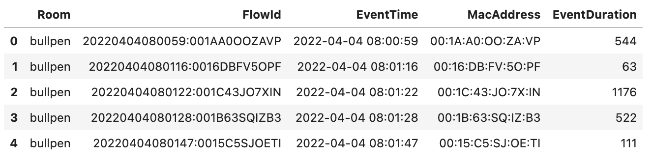
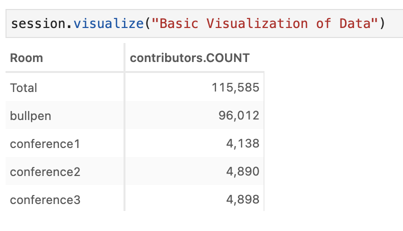
With our cube created, we can investigate what the data looks like, generally speaking. For example, we can investigate the traffic across rooms due to any connected IoT device.
Hierarchy management
Having investigated the basic shape of our data, there are other ways we would like to classify or investigate our data. For example, it would be useful to look at our traffic based on the time buckets. We have a datetime column. From here, we can use create_date_hierarchy to break this down further.
Since our data is all in the same year and month, we’ll only break this down to the day and hour. We’ll also create a separate date hierarchy for just the hour.
cube.create_date_hierarchy("DateTime", column=Flows["EventTime"], levels={"Day": "d", "Hour": "HH"})

cube.create_date_hierarchy("Hour", column=Flows["EventTime"], levels={"Hour": "HH"})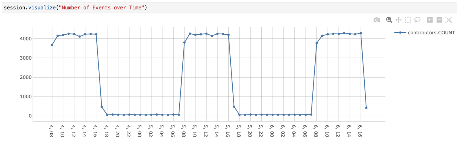
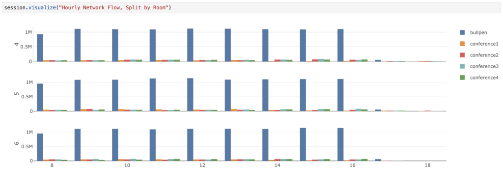
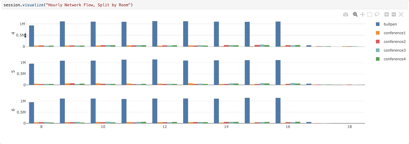
From this, we can already see something pretty intuitive: there is more network traffic between the hours of 08:00 and 18:00, which are reasonable working hours for an office.
We also notice that between 18:00 to the following 08:00, the network traffic doesn’t quite drop to zero. Let’s investigate what is contributing to this by drilling through on one of those hours.
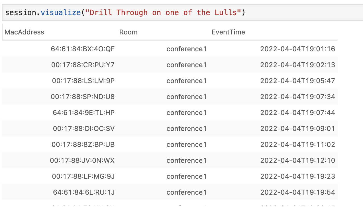
Looking at this, we see the mac address for these devices are similar. We can look up the manufacturer for these devices to see what they are, or at least, where they come from using a website like macvendorlookup.
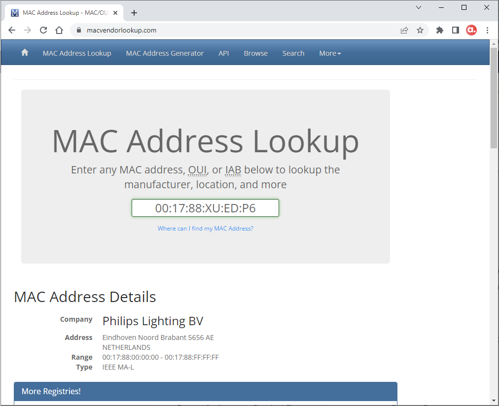
Looking up one of the devices beginning with ’00:17:88:XU:ED:P6′ we see the vendor is Philips Lighting. If the office has network connecting capable light bulbs, this type of network traffic makes sense. In the modern day, so many previously mundane objects are now ‘smart’.
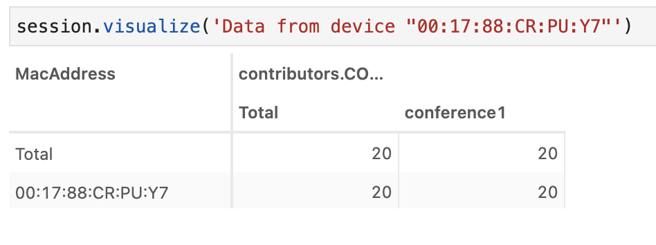
If we look at the data specifically for that device, it is always found in the same room. This makes sense, as a lightbulb shouldn’t travel, unlike, say, a laptop.
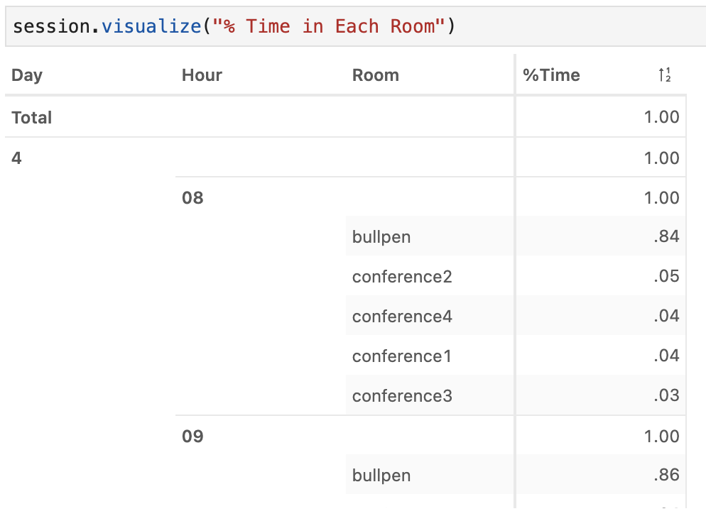
Now that we have the hierarchies we want, we can investigate what our data is saying, and create additional measures to gain insights on how people move in our offices. Before we start, let’s first see in better detail where people are in our offices during the day.
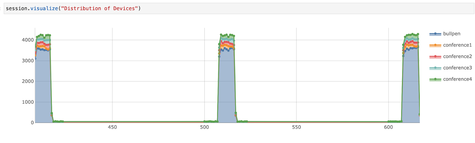
As would be reasonable to expect, the bulk of our traffic seems to be located in the bullpen area of the office during the workday. Some questions to consider:
- Do people stay fixed in the same area throughout the day?
- How many people tend to gather in the conference rooms when the conference rooms are in use?
- Is there a specific time during the day where a particular room is favored or disfavored?
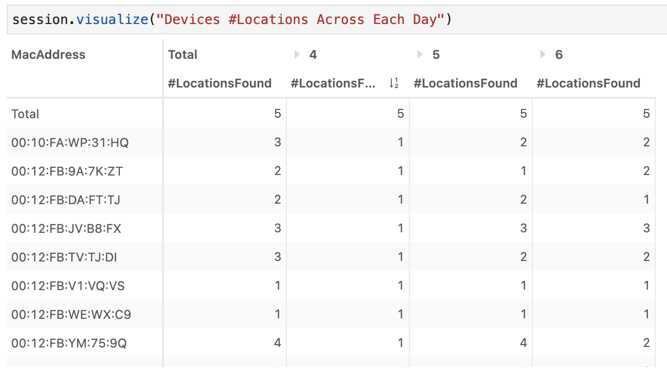
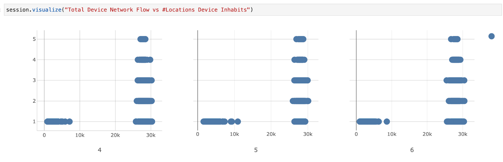
To answer these questions, we can create additional measures. Let’s start with creating a measure which returns the distinct # of rooms. This one simple measure will allow us to see two things immediately:
- how many devices cross through multiple rooms
- roughly how many of our devices are stationary devices that are from the office.
So, which devices are moving around? For this, we’ll look at devices found in more than one room. This will naturally exclude devices which are room features, as well as employees who either work in one conference room or are always in the bullpen area.

We can also get a sense of the types of devices from the flow traffic. For example, a person with a laptop and a smartwatch may only sit in the bullpen area, but those devices will likely log a greater amount of events than a lightbulb.
We get the sense that most of our devices are transient, meaning they, at some point or another, end up visiting every room. Let’s see when these rooms are occupied.
This is a bit difficult, since we already have devices like lightbulbs, which means there could be network traffic even if no humans are in the room. Let’s start with visualizing the duration of network events for each room per each hour. We’ll focus on the hours between 08:00 and 18:00.
We see conference rooms usage throughout the day. However, zooming in, conference room one seems to become unpopular in the afternoon.
Let’s recreate this same visual, excluding the bullpen data.

It seems like Conference Room 1 becomes unpopular as the day goes on. There could be many reasons for this:
- It gets hot/cold
- The sun/lighting gets worse throughout the day
- Fewer people need that room and its features
- Or other reasons
From an office management point of view, it is clear either its conditions need to be investigated, or the amount of resources to it could be diverted.
Let’s also create a similar measure counting the distinct mac addresses. This can help us see how many devices are in a room during a specific period.
m["#DevicesFound"] = tt.agg.count_distinct(Flows["MacAddress"])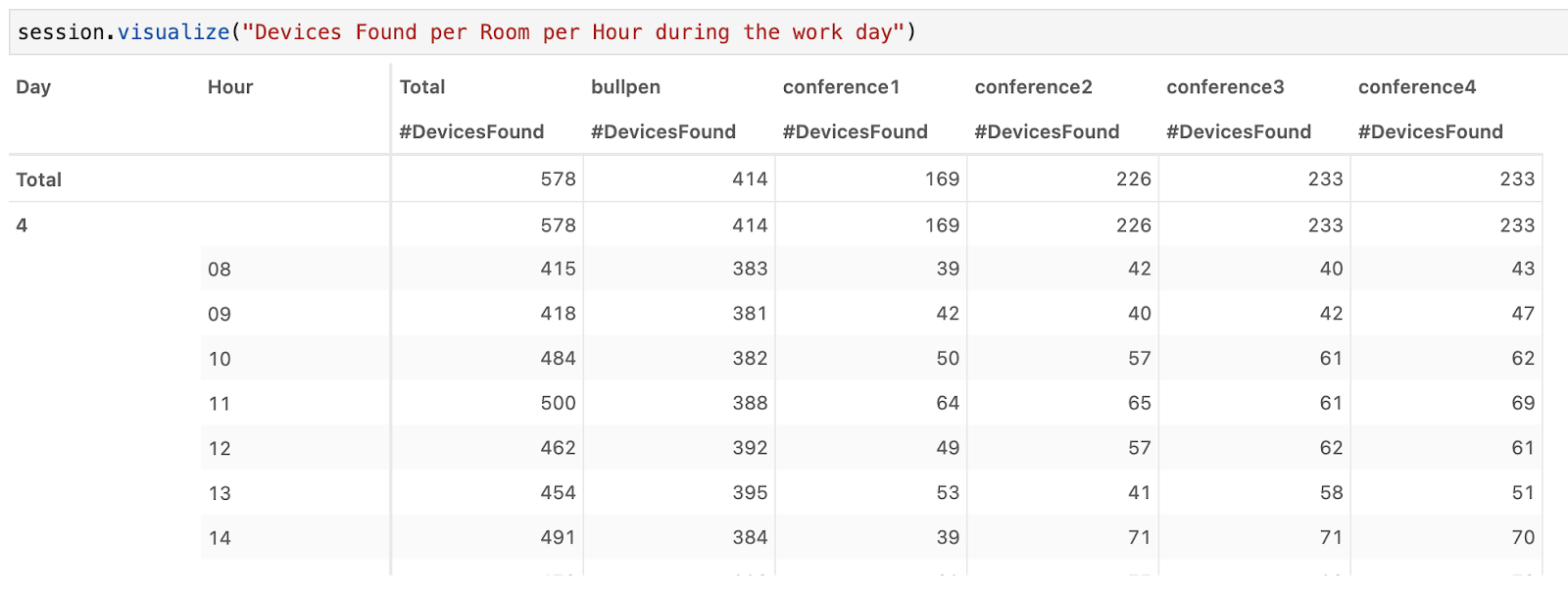
What else can we see from this data?
For example, how long, on average, does a device stay in a conference room? For this, we’ll build this metric up iteratively. Let’s start with determining what percent of time a device spends in a conference room while active (ie, actively communicating). Ideally, we would exclude any IoT device natively a part of that room, but we’ll include them for now.
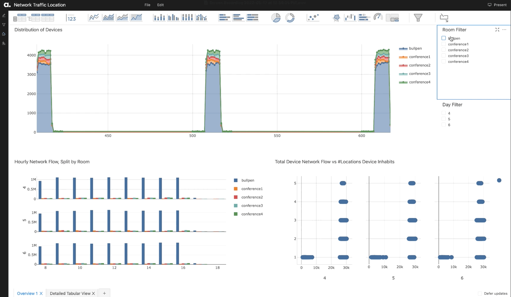
This dashboard summarizes the data, providing a view of how users use their office space over time.
We hope you enjoyed this exploration. Visit our GitHub notebook gallery for this and other examples.