

How frequently do you perform a top count while doing some data analysis? In this article, we do a quick comparison between 2 python libraries – Atoti and Pandas – to see how we can achieve the below tasks with the Google Play Store Apps data from Kaggle:
- Visualize top 10 apps with the highest rating in table
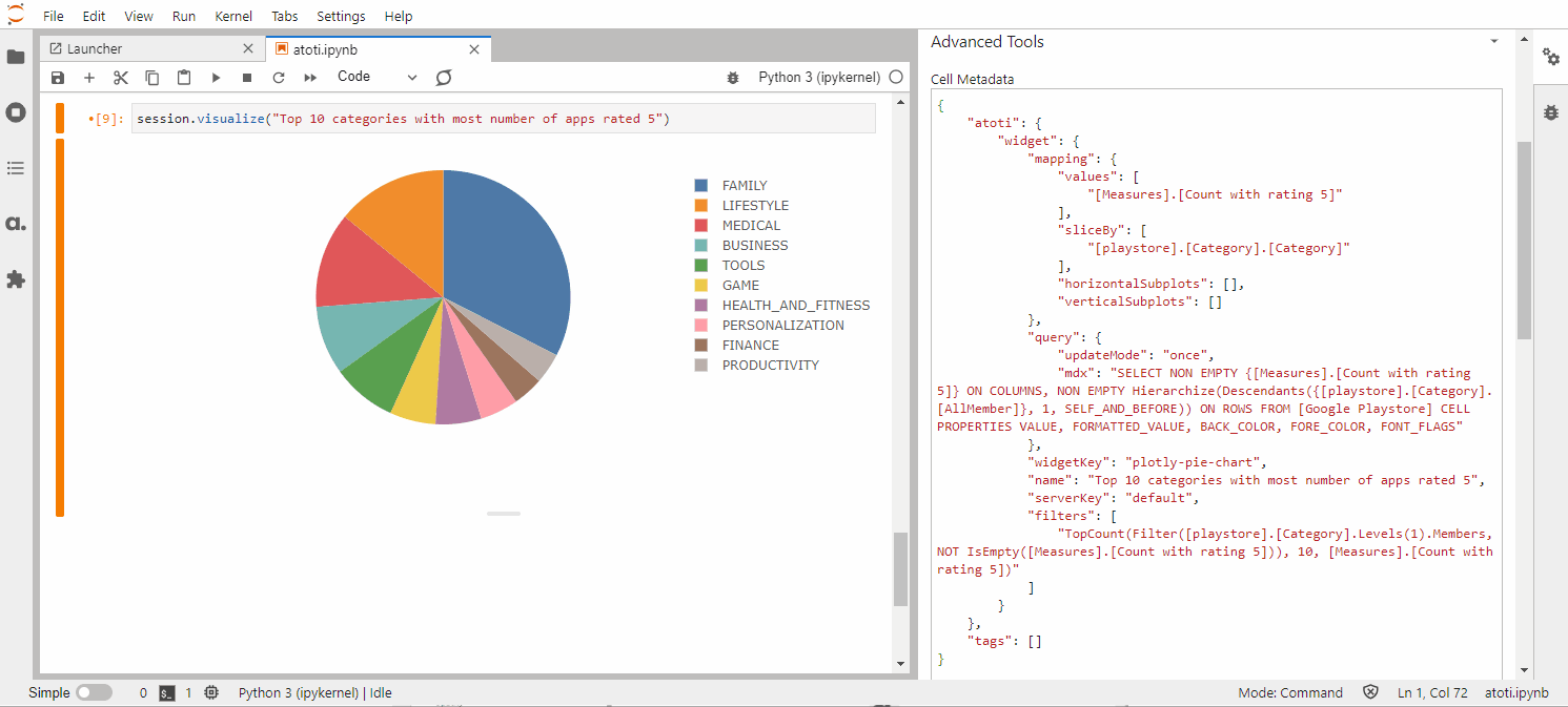
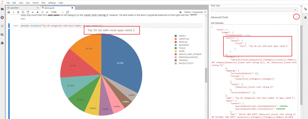
- Visualize top 10 categories with the most number of apps rated 5 in Pie chart
- Visualize top 10 apps within each category in subplots
Note that data has been processed to convert strings for millions and thousands abbreviations into numeric data.

Visualize top 10 apps with the highest rating in table
Pandas
We can make use of nlargest function to return the top count:

Note that the above method is equivalent to the following:
df_playstore.sort_values(["Rating"], ascending=False).head(10)
Atoti
Assuming we have the data loaded into the cube, we can run the command cube.visualize() to create a visualization.
As we can see from the GIF above, Atoti requires minimum coding and users can add levels and measures to the visualization from Atoti’s editor, a Jupyter extension.
Quick Compare

Visualize top 10 categories with the most number of apps rated 5 in Pie chart
Computing number of apps rated 5
Before visualizing, let’s have a look at how we can derive the number of apps rated 5 for each category with the two libraries:
Pandas
cat_app_rated_5 = (
    df_playstore[df_playstore["Rating"] == 5].groupby(["Category"])["App"].count()
)
With the above code, we get a list of categories with the number of apps rated 5 which is sufficient for our data visualization.

Atoti
m["Count with rating 5"] = tt.agg.sum(
    tt.where(m["Rating.MEAN"] == 5, m["contributors.COUNT"], 0),
    scope=tt.scope.origin(l["Category"], l["App"]),
)
Essentially the above code snippet is similar to the one from Pandas, in the sense we need to select only the apps with “Rating” equals 5. However, Atoti aggregates the count at the scope of the “App” and “Category” levels. This means that we can visualize the number of apps with rating 5 at any level:
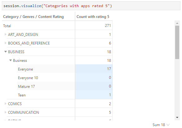
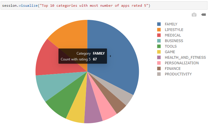
Visualizing top 10 categories
Now let’s see how we can visualize the top 10 categories with the most number of apps rated 5.
Pandas

pandas.DataFrame.plot.pie is a wrapper over matplotlib.pyplot.pie(). We can use it to plot a pie chart directly from the DataFrame.
Using the function as it is, gives us the pie chart on the left.
Just as how we would configure the pie chart with Matplotlib, we can also customize the pie to display the value of each slice.
To do that, we create a function to compute the value:
def func(pct, allvals):
    return int(pct/100.*np.sum(allvals))
Atoti
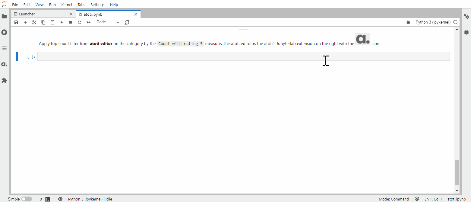
As we have seen earlier on, with session.visualize(), we can create a visualization in the Jupyter notebook interactively via the Atoti editor.
We can mouse over the pie chart slice to see the number of apps that fall under the category.
Alternatively, we can display text in the chart by setting isTextVisible to true in the cell metadata.
Quick Compare

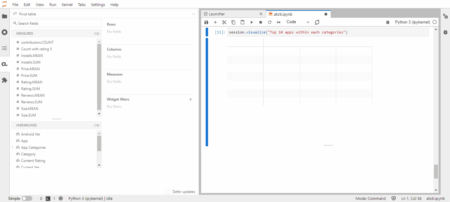
Visualize top 10 apps within each category in subplots
Pandas
In this use case, we apply the equivalent of “largest” where we perform sorting before we obtain the first 10 rows using the “head” function. By sorting the metrics in ascending order, we get the bottom count (since the smallest value is at the top). Conversely, sorting the metrics in descending order (ascending=False) gives the top count.
df_playstore.sort_values(
    ["Category", "Rating"], ascending=False, inplace=True
)
top10_by_cat = df_playstore.groupby("Category").head(10)
Note that we have to perform a “groupby” by the category before applying the “head” function since we want the top 10 of each category.
What is more cumbersome is the visualization with subplots. Although Pandas support subplots in their charting, each column translates to a subplot against a different metric. In this use case, each category translates to a subplot that is against the number of reviews, split by apps. It is easier to plot using Matplotlib instead as it gives us more control over the plot.
However, control is a double-edged sword.
Pros and cons of chart controls
Pros:
- We can control the number of rows and columns we want to display the subplots over.
- We can control the size of the plots.
Cons:
- As with any library, we need to have the “know-how”. Even then, we have to keep adjusting the style such as the size, until it turns out the way we want.
For instance, we get all the subplots overlapping each other with the below code snippet as we do not configure the “figsize”.

The labels didn’t turn out that well with autoscale() function enabled, which is a common problem with charting. It is possible to find alternative solutions such as using tooltip to show the label instead. However, we won’t be exploring that in this article.

Even with “figsize”, it can be a hassle to adjust the size of the figures so that the charts can all fit nicely within the notebook. As there are 33 categories available, we are going to select just a few categories so that the display can appear nicely:
data = top10_by_cat.loc[
    top10_by_cat["Category"].isin(
        ["BUSINESS", "FAMILY", "LIFESTYLE", "MEDICAL", "TOOLS", "GAME"]
    )
][["Category", "App", "Reviews"]].copy()
With figsize=(25, 10), the subset of charts is rendered nicely.

Atoti
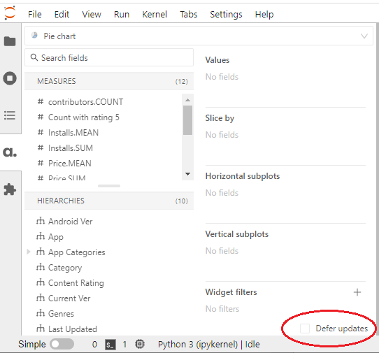
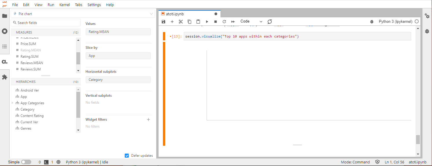
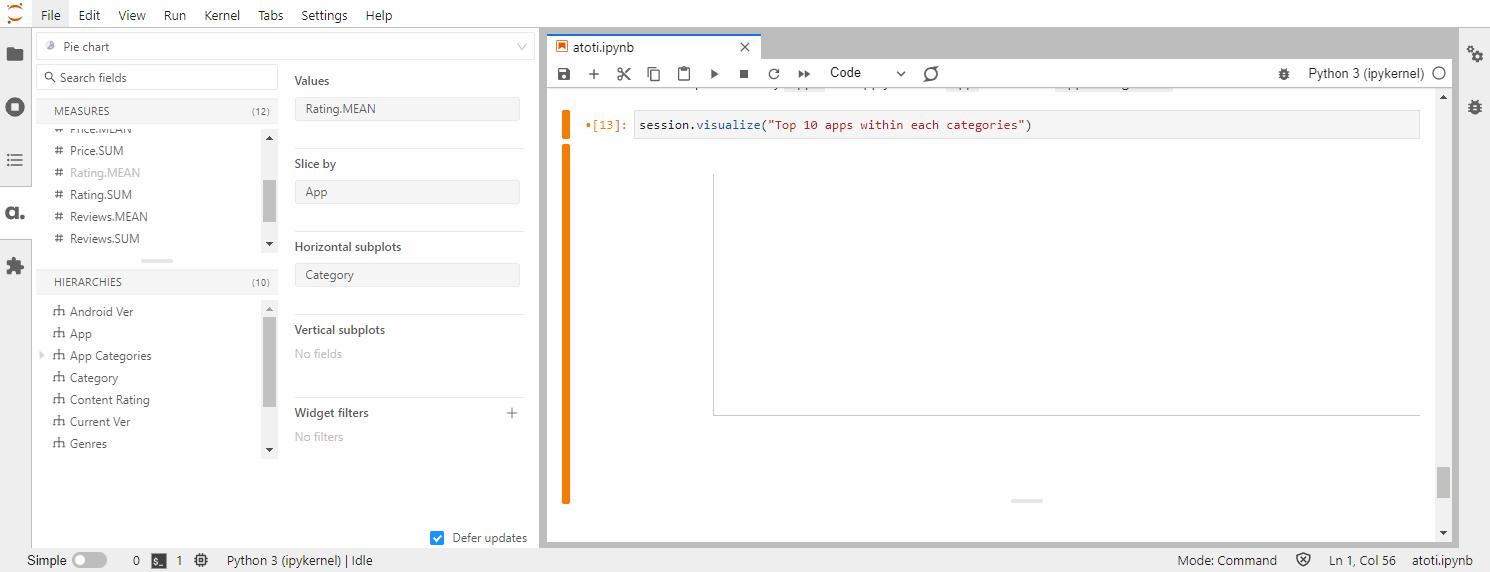
From the Atoti editor on the left navigation menu, select a chart type visualization from the drop-down list.
In order to prevent the rendering of the charts as we perform modifications, we can turn on the Defer updates option.
We can now add “Category” under horizontal subplots, with “Reviews.MEAN” as the value and sliced by “App”. We can see that the chart doesn’t get rendered.
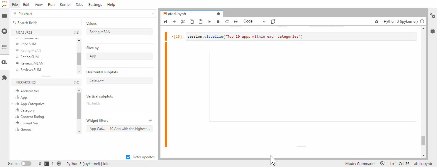
Let’s drag “App Categories” into the Widget filters and toggle to the advanced filter mode.
Since “App Categories” is a multilevel hierarchy, we have the options of:
- selecting the top app or top category from the drop-down list
- applying filter within the Category (“in each Category” checked) or across the category (“in each Category” unchecked).
Since our objective is to achieve the top 10 apps within each category, we select “App” from the drop-down list and select the “in each Category” checkbox.
Finally, unchecking the “Defer updates” checkbox triggers the rendering of the chart.
While there are 33 categories in all, the widget displays only the first 6 charts. As shown previously, the tooltip is available over the slices to show the relevant metrics.

We can use filters to select a subset of categories to view. Alternatively, access the web application that is included in the Atoti library using:
Interactive filtering in Atoti web application
Launch the Atoti web application in a web browser by clicking on the link returned by session.link(). We can then build a dashboard that allows users to perform quick filtering on the charts:

Not only so, but the dashboard can also be saved and shared via its URL.
Note that while it may seem that users have less control over Atoti’s charts, we can actually access its underlying state and modify its properties. Atoti’s charts are built on top of the plotly library, hence we can configure the chart’s properties as per plotly’s figure reference.
Quick Compare

Did I miss something? How do you handle top count in a notebook? Drop us a note! Otherwise, you can check out both implementations here.