While trying to perform a time-series analysis, there are many things to check. For instance, the above GIF shows me trying to scroll through the Matplotlib charts for each time-series for stationarity checks.
In the above use case, I’m evaluating 12 feature time-series for 12 cryptocurrencies and that amounts to 144 charts. Perhaps I am a little too ambitious to run the test for all the cryptocurrencies in one go. Then again I don’t see why I shouldn’t, since the steps for the analysis are pretty much the same.
What would you do in this case? Would you run the notebook repeatedly or duplicate it once for each cryptocurrency? I chose to load my data into Atoti and visualize the time-series using interactive dashboards.
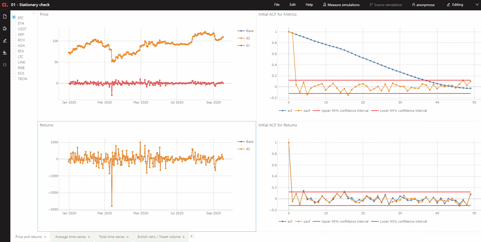
Now I am able to put together my analysis within a common view and filter by the cryptocurrency that I want to dive in. Did I mention that I also loaded each differencing of the time-series into the cube?
It’s interesting to see how the time-series becomes stationary with each differencing, represented by a different colored trace for each of the feature’s plot in the above GIF.
As a next step to my analysis, I ran the Granger causality test on the time-series for 50 lags to see which features can Granger-cause the returns of the cryptocurrency. Check out below a dashboard that I’ve built to quickly identify the features that I will use in my time-series forecasting for each cryptocurrency.
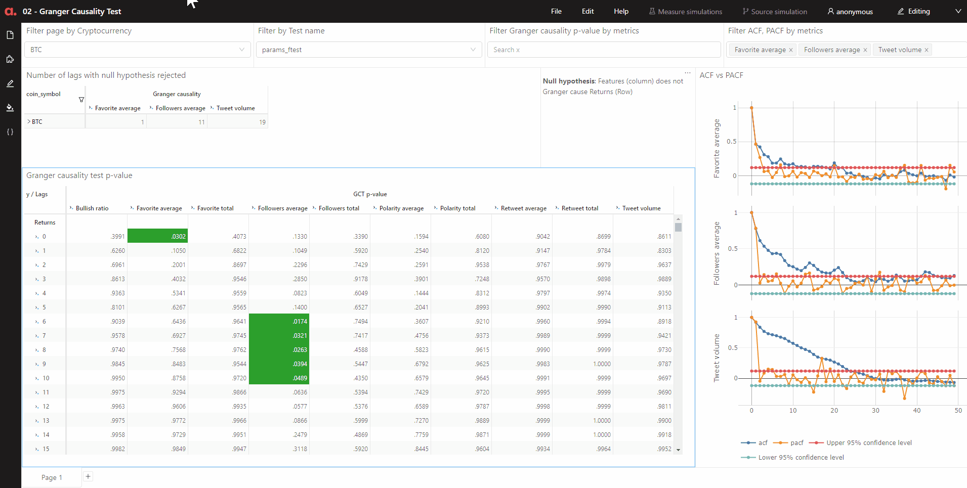
I can run and save as many lags of the test results into atoti and apply filters and color coding the cells (in green above) to see the lags that were rejected. This means that I do not have to discard my test results prematurely.
By using the Quick page filter widget that comes with Atoti, I can apply filters easily on the page and toggle around the cryptocurrencies compare the patterns revealed by the statistical analysis.
Lastly, I personally preferred the Atoti’s charts in a dashboard over Matplotlib charts in a Jupyter notebook, namely due to the interactive aspect. I can zoom in literally on the charts that are of interest and mouse over to see the relevant values.
In any case, I can always output my data from the Atoti cube when needed by:
- exporting tables to csv
- downloading plots as png
- programmatically querying from the cube into a Pandas dataframe

Check out my notebook and article on how I forecast the returns of different cryptocurrencies with Twitter attributes.
Do share with me on how you manage your machine learning results!