Discovering trends in your data via bucket analysis is easier than ever
Performing bucket analysis? What makes for a good bucket? Is it free of holes? Does it hold the volume you need? Is the handle ergonomic?
Oops, wait. That’s the wrong bucket analysis, and using Atoti might be overkill for that. Let’s try this again.
“Bucket” is another way of talking about categorization, like “5 minute time buckets” or “bucketing by risk class.” So, when we talk about bucket analysis, we’re talking about a form of qualitative data analysis, and it is used quite a bit in Business and Finance. Read on to see how we can perform this type of bucket analysis with Atoti and check out our notebook on this topic in our notebook gallery.
Bucket Analysis in Python
The goal of bucket analysis is to break down trends by slicing our data via different bucketing criteria. If you have a large volume of data Excel can fall short of the task. When that happens, we often turn to Python to continue our exploration. In Python, we have the freedom to choose our set of libraries: which libraries to aggregate our data, which to use to visualize. By choosing Atoti, we streamline our techstack: Atoti can consume data directly from different data sources or from Python data structures like Pandas DataFrame, and Atoti comes with visualization capabilities where users can visualize their data in JupyterLab or create dashboard in the Atoti UI interactively. Check out our notebook to see how we to instantiate an Atoti session and spin up a cube to get started.
Bucket Creation
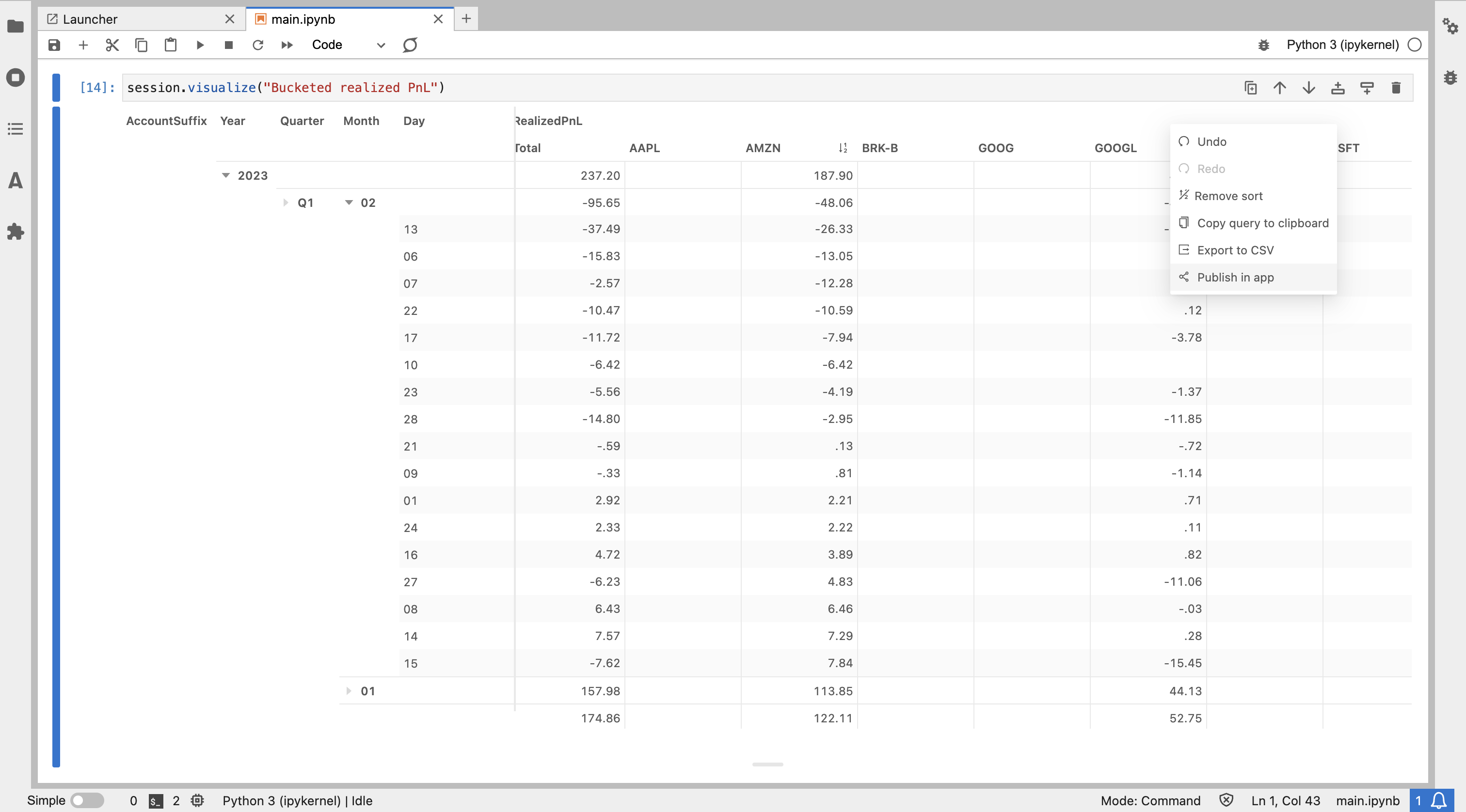
Time is a common axis to explore via buckets; in our example notebook we predominantly focus on time based bucketing and investigate how time relates to our PnL.
Here’s a highlight of a few features of Atoti we use along the way:
- We order our data using atoti.order
l["Date"].order = tt.NaturalOrder()
l["DateTime"].order = tt.NaturalOrder()
l["Timestamp"].order = tt.NaturalOrder()- We create date related hierarchies using atoti.cube.create_date_hierarchy – no need to create these columns in our underlying data
cube.create_date_hierarchy(
   "Date hierarchy",
   column=txn_tbl["Date"],
   levels={"Year": "yyyy", "Quarter": "QQQ", "Month": "MM", "Day": "dd"},
)- We create our metrics using atoti.agg (a subset listed below)
m["PurchasePrice"] = tt.agg.single_value(txn_tbl["PurchasePrice"])
m["TransactionPrice"] = tt.agg.single_value(txn_tbl["TransactionPrice"])
m["RealizedPnL"] = tt.agg.sum(
    tt.where(l["Action"] == "Sell", m["TransactionPrice"] - m["PurchasePrice"]),
    scope=tt.OriginScope(l["TransactionId"], l["Action"]),
)- We utilize the Atoti JupyterLab extension to visually explore our data
Interactive Exploration
Within a JupyterLab notebook, we can leverage Atoti’s JupyterLab extension to explore our data as we go, deciding if we have all the perspectives we need or if there is something we should refine. The JupyterLab extension allows us to create in-line visualizations in our notebook, allowing us to visualize without coding.
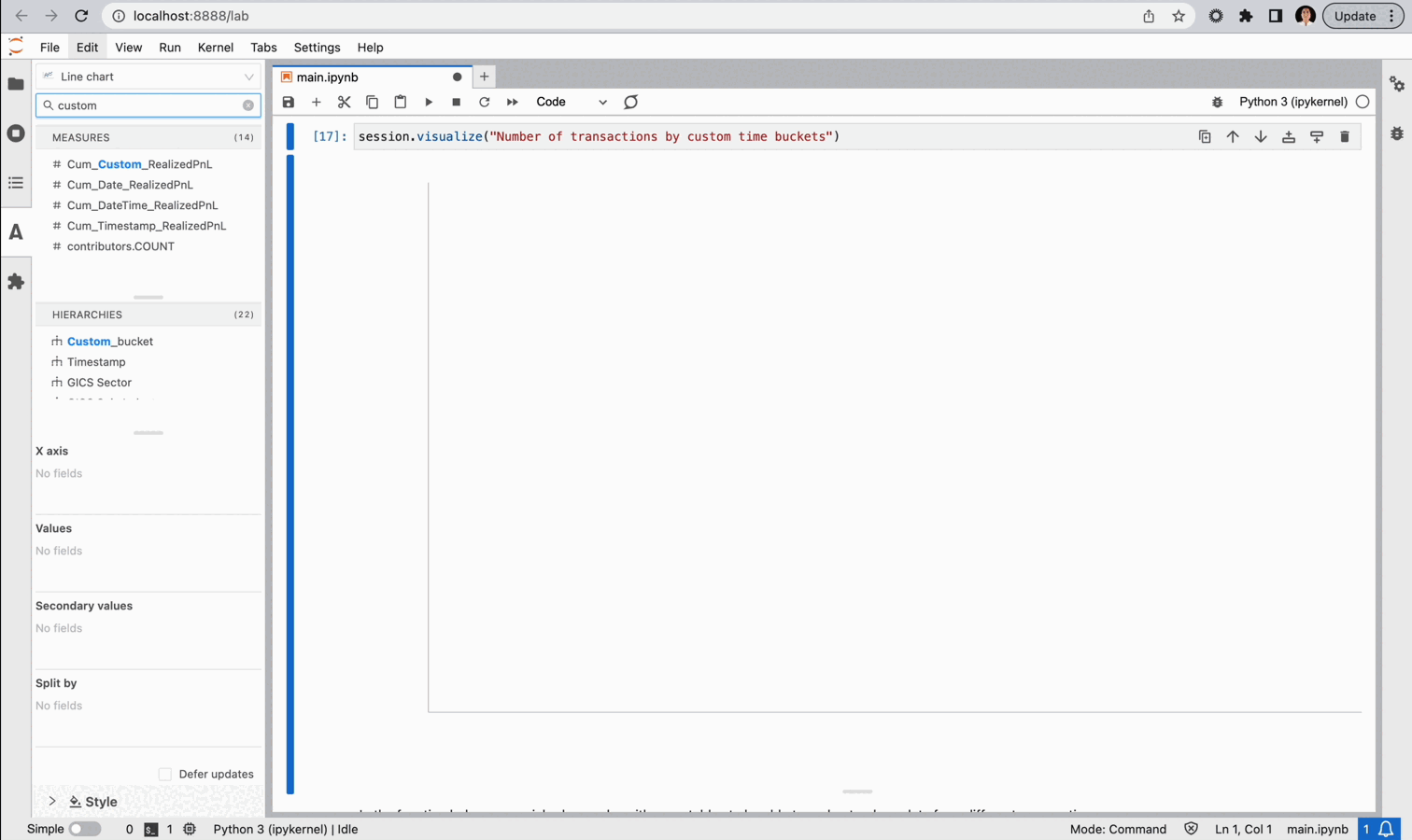
And, if we think a particular visual is informative we can save it for later.
Also, we can leverage Atoti’s dashboarding WebApp to create dashboards exploring the data. We can use the widgets already created from our notebook exploration. Or we can create new ones on the dashboard itself. With Atoti, it is easy to explore trends by slicing our data on different bucketing criteria.