California wildfires are increasingly intense. Understanding how these wildfires impact everything from air quality to solar irradiance is crucial.
In January 2020, California mandated solar panel usage in new construction. Even before 2020, and certainly since, solar panel adoption increased year after year. But at the same time, California experienced increasingly intense wildfire activity. An EIA white paper discusses the impact on solar irradiance and solar energy generation, while other articles detail the impact of California fires on Colorado air quality.
To demonstrate some of the impact of these wildfires, we used the BI analytics tool Atoti. We look at California solar GHI data, combined with wildfire data, to show how GHI is affected during these fires, and what that means for the potential electricity generated by solar panels. This work is published in a notebook which is available on Atoti’s notebook gallery.
This piece is demonstrative and makes several simplifying assumptions; a more thorough example of the type of work around GHI data and solar potential is available in this paper Modeling Solar Irradiance. For more information on getting started with Atoti, check out its tutorial or this introductory guide.
Background
GHI, or General Horizontal Irradiance, is the combination of Direct Normal (adjusted for solar angle) and Diffuse Irradiance (DNI and DHI, respectively). Direct Normal Irradiance comes from direct solar light, barring any reflection or loss. Diffuse Irradiance comes from the atmospherically reflected solar light–much like how on a cloudy day there is still light available to illuminate the surrounding. Solar panels charge via the availability of both DNI and DHI-though more efficiently via DNI-so GHI can be used to capture overall solar potential.
For the purpose of this exploration, we focused on California and used +20UTC time data, or noon standard time in California. This is when the sun is near to its zenith, thus around the time when GHI is likely to be at a daily peak, barring cloudiness and such. We focused on the years 2016-2020, with each year’s data collected into separate files. We loaded each file and concatenated the data to create one dataframe for the whole time range. The process by which this data is sourced from the NREL database is documented in the 01-nrel-data-sourcing. The locations (latitudes and longitudes) associated with the solar data were also sourced from the NREL database and saved to a separate file.
The fire data was sourced from fire.ca.gov, stored as a json for each year. The separate jsons were merged into a single dataframe, which was saved as a feather file. This process is documented in the 02-fire-data-sourcing notebook. These files were ingested to create the cube on which we performed our exploration.
Expected vs actual GHI
GHI roughly follows a sinusoid-like pattern, though the precise curve predicting GHI is far more complicated than just that. For simplicity, we used a basic shifted cosine curve. Since January 1st is relatively close to the winter solstice, the anticipated GHI shape should look very much like a negative cosine curve.
We created an “expected” ghi curve given by
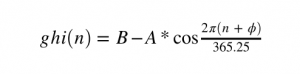
where
- φ is the phase shift (in days), based off 2015’s winter solstice date
- n is time (in days) starting from the beginning of 2016
- A is the amplitude
- B is the vertical shift
A = (1050 - 419) / 2 # amplitude
phi = 10 # offset from 2015's winter solstice
B = 419 + A # vertical shift

m["ghi_exp"] = B - A * tt.math.cos(
 2
 * np.pi
 * (tt.date_diff(date(2016, 1, 1), l[("ghi", "Date", "Date")]) + phi)
 / 365.25
)

# creating the delta check
m["GHI diff"] = m["ghi.MEAN"] - m["ghi_exp"]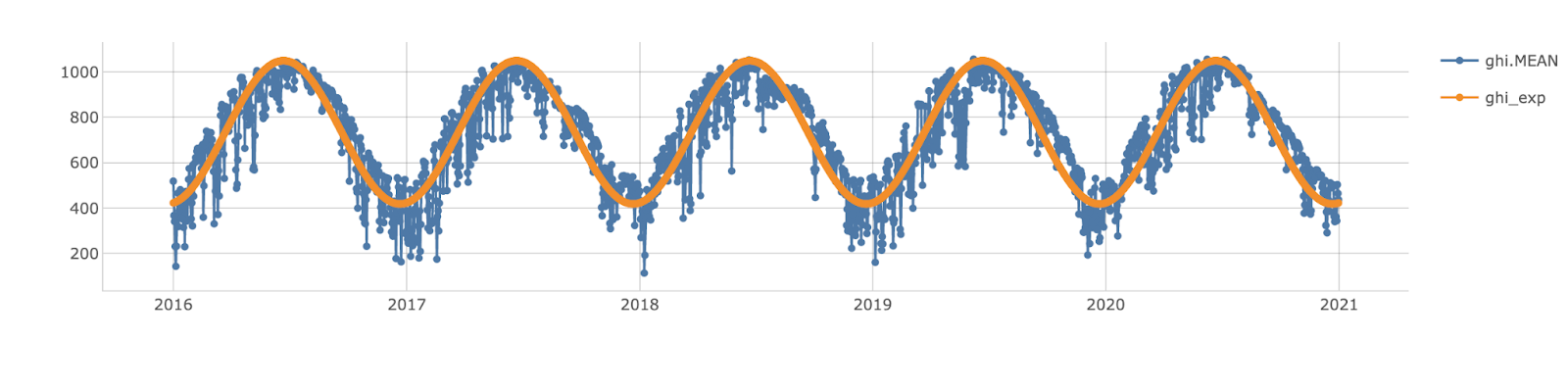
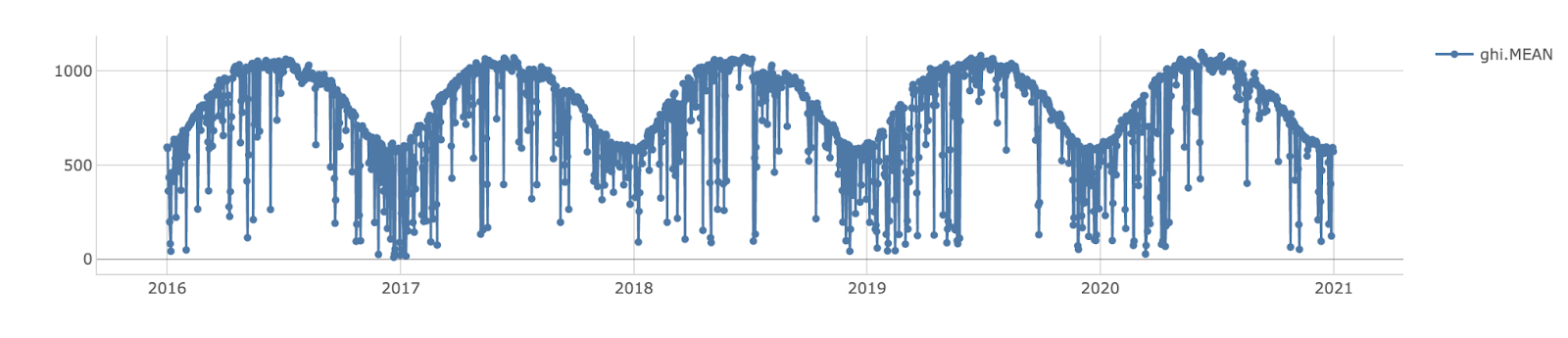
Our curve was a bit of an underestimate, but still sufficed for this exercise. We expected some noise in our GHI data, but comparing it to the expected curve, we saw some segments where there were larger, sustained deviations in the curve, such as around July 2017, July 2018, and even March 2020. We investigated a subset of those times and compared it to wildfire activity during those times.
Fire locations and acreage burned
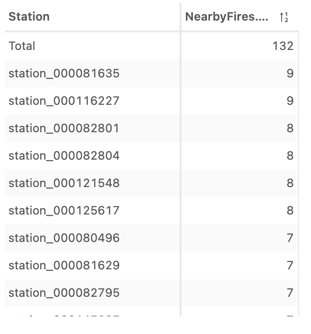
NRSDB data is sourced from weather stations spread across the United States, interpolated into an evenly spaced grid of stations, and we selected a subset of the stations locations in California for this exploration. We started by seeing how many of these stations were close to fires. Since the locations were given by latitude and longitude, the distance was in degrees. We used just under 0.1 degree distance as our definition of “nearby”. This assumed a spherical earth, since one degree longitude is not equal to one degree latitude in the oblate-spheroidal case.
There were 132 stations which had more than 5 fires nearby in the past five years. We filtered to look at the GHI data for one of the stations that had been near 9 fires. More so than the overall GHI mean curve, it demonstrated quite a few times where there seemed to be lost irradiance.
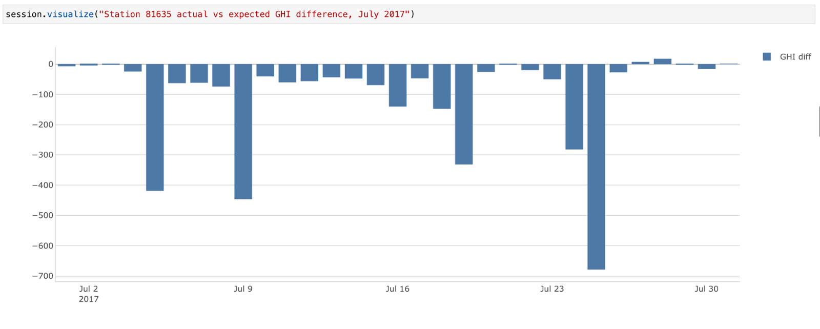
Looking at one of the “rough patches” in July of 2017, we explored how far our GHI was from expectation.
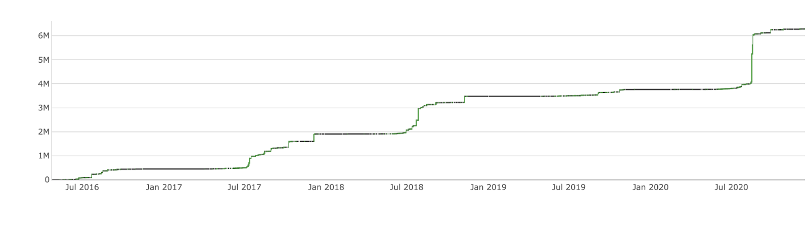
Looking at the various GHI curves, there seemed to be a recurrent theme of lost GHI around July or so. Fire season in California typically runs from July through October. Using the fire data’s start date, we visualized how the start dates broke down during a calendar year, scaled by the acres burned.
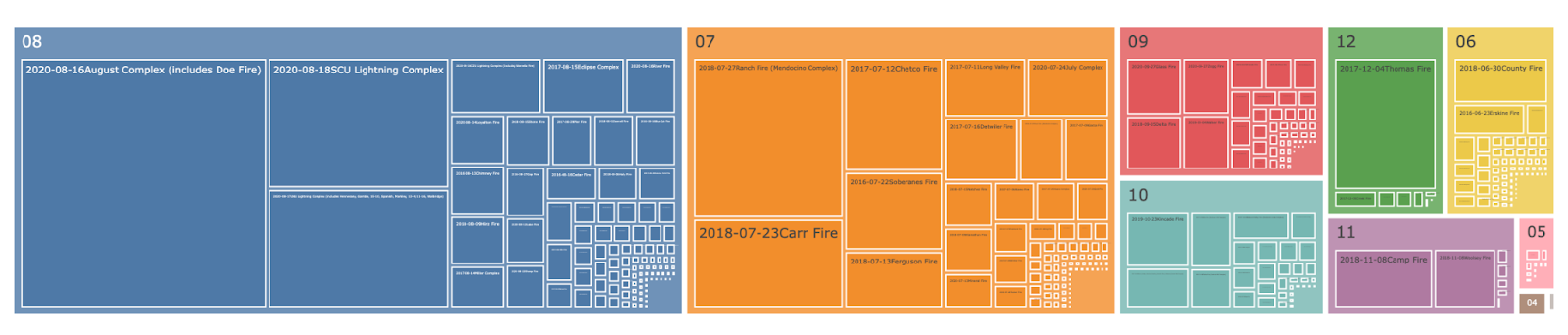
We also saw how the large fires from July and August impacted overall acreage burned.
Impact on solar potential
Depending on the technology used, solar panel technology is capable of converting anywhere from 20-50% of available GHI to usable solar energy. The approximate kilowatt and accumulated kilowatt-hour output one can expect is given by
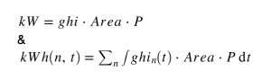
where
- n is days
- ghi_n(t) is the function of varying ghi value over time throughout one day
- Area is the Area of solar panel,
- P is the performance efficiency.
For the sake of exploration, we assumed 35% efficiency for P.
Since we saw so many large fires in July and August, we focused on July alone. As we’ve only sourced noon data, we had to estimate the daily variation in GHI. Though not perfectly sinusoidal, we used the following to model to approximate the daily variation:
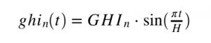
where t is the time from sunrise to sunset, and H is the total daylight hours for the day.
There are roughly 14 hours of daylight in California during the month of July. Using this, we computed the integral of this sine function, leaving the summand over days for computing potential kilowatt hours.
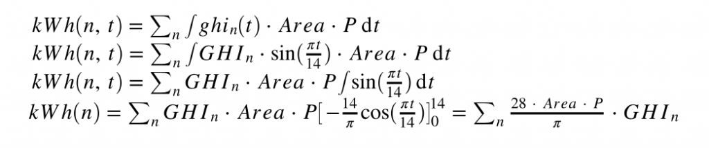
From this, we saw how much potential we had lost across each July, and see in particular 2018 had quite a bit of lost potential compared to other years.
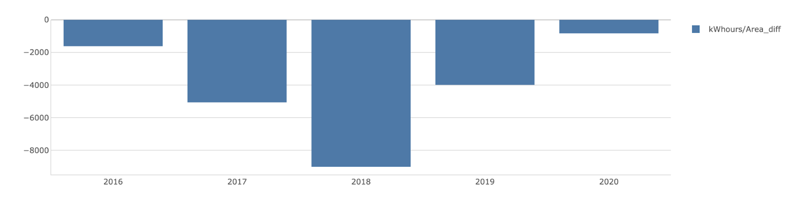
And for that station we zoomed in on before?
In 2018, we found we lost nearly 16 MWh per solar panel area near Station 81635! Given the month’s expected potential was around 100 MWhr, this represented about 16% lost potential for homes in that area.
Simulating a better July
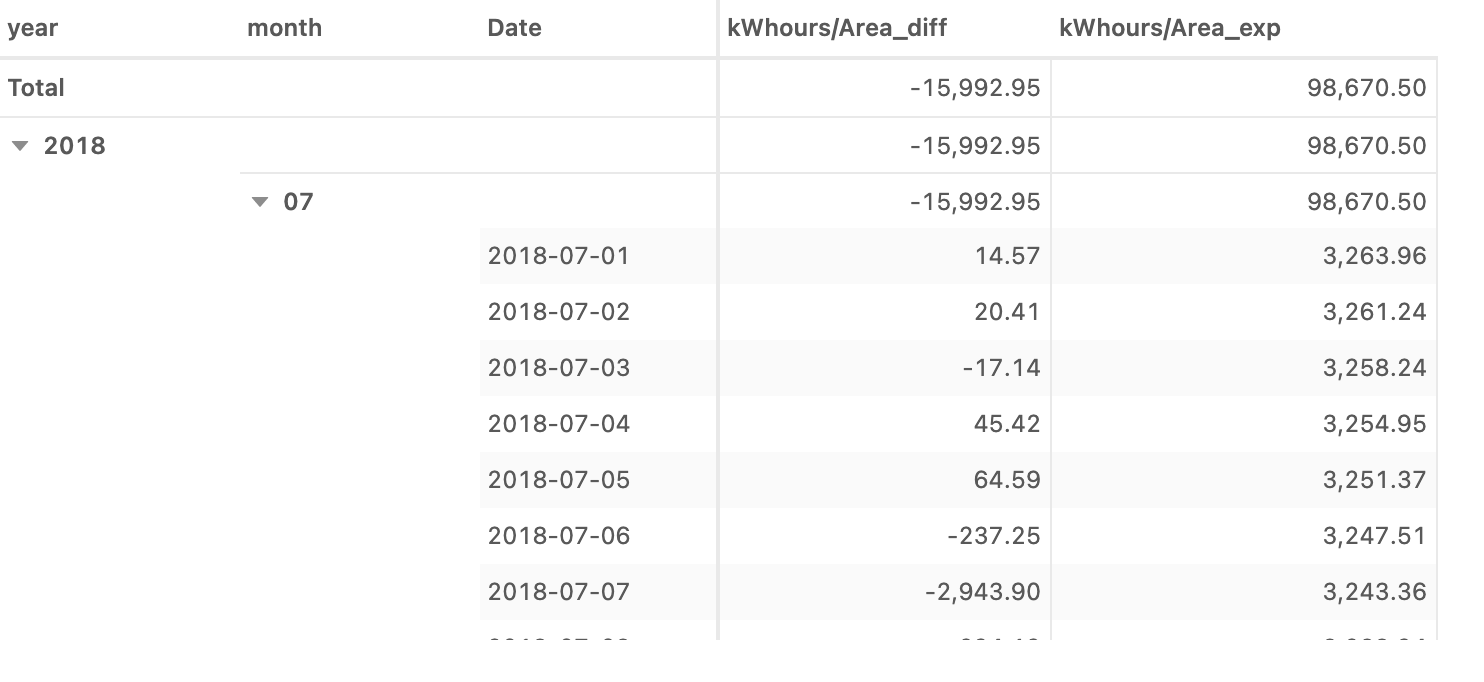
What if there were fewer fires in July, such that we weren’t experiencing diminished GHI? How would that impact our solar potential? We can investigate these by creating different scenarios.
With Atoti, we could create a scenario which assumed solar data remained exactly as is for the remainder of the year but behaved according to the expected curve (still an underestimate!) during each July. How would that have impacted the solar energy potential?
Conclusion
As documented in numerous news articles and research papers, there is a demonstrable impact of California wildfires on GHI and thus potential solar energy generation. Through our exploration, we were able to analyze the existing data to determine where fires were impactful, and run simulations to determine loss and future potential.